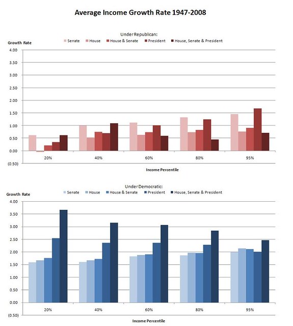
Chart: Why (all) elections matter
Mon Sep 13, 2010 5:42 PM EDT
@
MaddowFactchecker writes on Reddit:
I saw this chart (http://voices.washingtonpost.com/ezra-klein/bartelschart.gif) about the growth of income disparity on Rachel Maddow Friday night and became a little suspicious since the chart was based only on the President in power's party. I decided to do some research and see what the numbers show based on who controls the House and Senate as well.
In short, the chart we animated last week more than passes inspection. The rest -- including sources and links -- you can get from @MaddowFactchecker. It's well worth the look.

No comments:
Post a Comment